Megaron the Athens Concert Hall 19-20
For a second year in a row we designed the visual identity of the Megaron- the Athens Concert Hall for the 2019-2020 artistic period. The nature of the project as well as its scale – both at the level of com- municating with a broad audience, as well as at the level of implementing a multitude of applications – create a highly complex set of specifications and needs, that require a comprehensive handling.
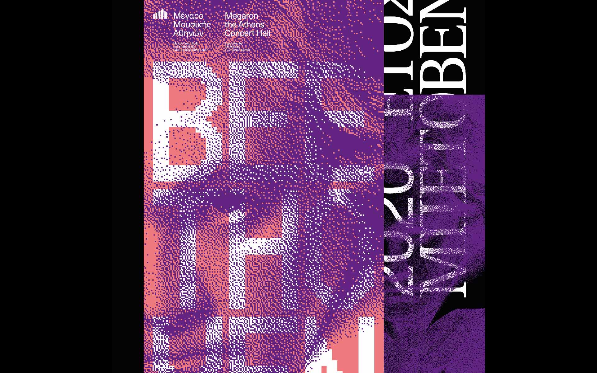
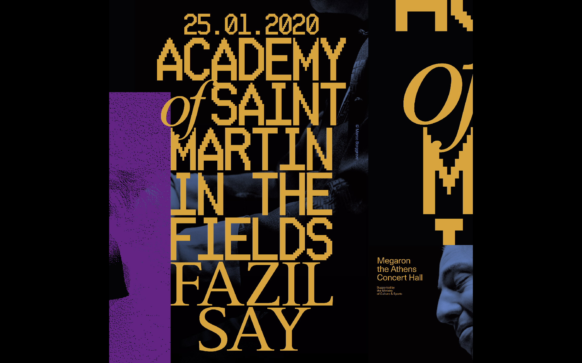
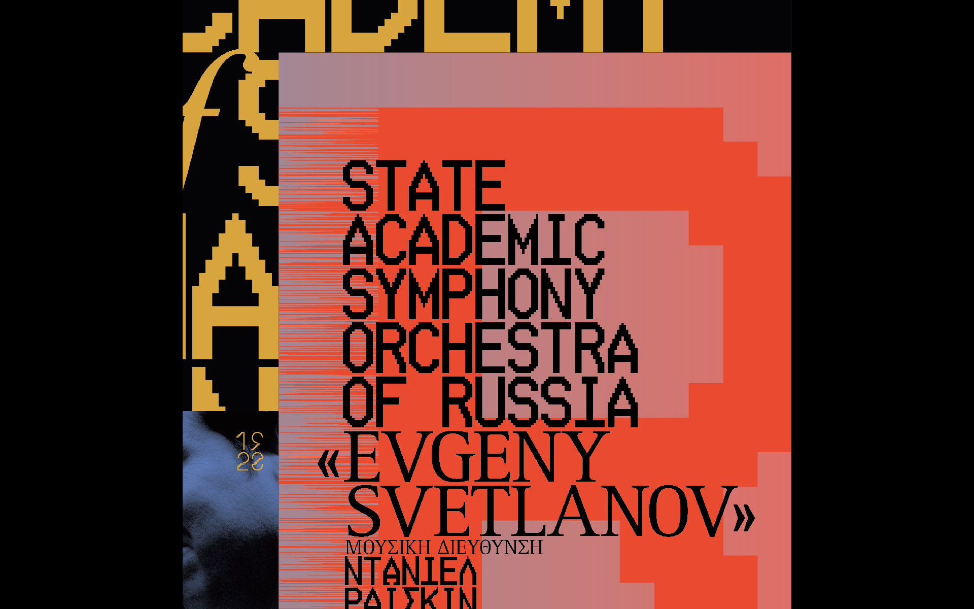
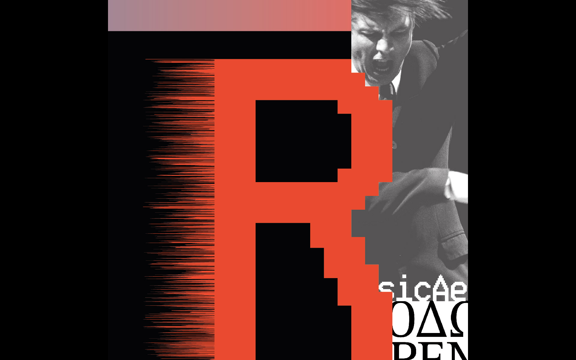
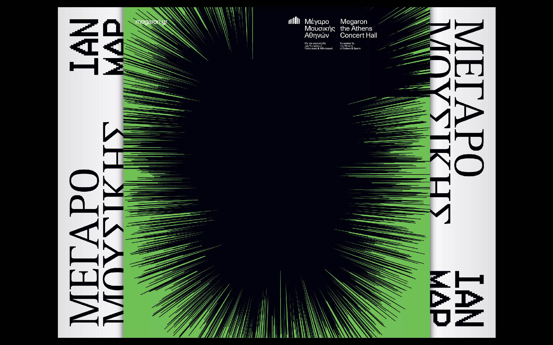
During the recent years Megaron has made a dynamic opening to a wide range of cultural activities. Our aim was to create a meaningful and aesthetic overall correlation of all these activities, in order to develop a coherent visual vocabulary. The common denominator of all these actions is music and, by extension, sound. This year’s goal of the Megaron artistic director was to make an even bolder step regarding the visual identity of the organization, seeking an even more contem- porary gaze that would combine “classical” with “modern” concepts, through a key feature, that of “sound intensity”.
Once again, we focused on the components of sound and their visual performance – we were called upon to produce visual sound. We ‘saw’ the sound in the forms that iron chips take under the influence of an electromagnetic field, where condensations and dilutions create visual in- tensities. We chose to build a visual system that tries to deliver the visual feel of the volume, through a linear “weave”: a weaving system, that sometimes develops more linearly and sometimes more organically, a weaving system that in an almost hybrid way intertwines with the typographic elements that pull together and complete the identity.
Such as in music, the new visual language is governed by a set of strict synthetic rules that are capable to piece together, aesthetically, all the acts taking place in Megaron. This new visual-mu- sic language has been interpreted, codified and translated into a design system consisting of an ever-changing pattern of linear intensities that can – more or less abstractly – represent notions and images. At the same time, the visual identity is complemented by the hybrid amalgamation of a serif typography, that reflects the classical side of the concert hall, combined with a pixel oriented typo- graphic language, that marks the place of the organization within the contemporary artistic aesthetics.